

White may seem like the most straightforward paint color—but in commercial spaces, it’s one of the most strategic choices you can make. The right shade of white doesn’t just look clean; it improves lighting efficiency, complements your brand identity, and helps create a professional, welcoming atmosphere. Whether you’re repainting an office, refreshing rental units, or updating a large-scale HOA property, white offers unmatched versatility across different property types.
However, not all whites are created equal. Subtle differences in undertone, sheen, and light reflectance can significantly affect how a white looks and performs—especially in spaces with mixed lighting or high traffic. Warm whites may create comfort in residential-style lobbies, while cooler tones can add clarity and focus in office environments. The finish matters too, with eggshell, satin, and semi-gloss playing different roles depending on the surface and usage.
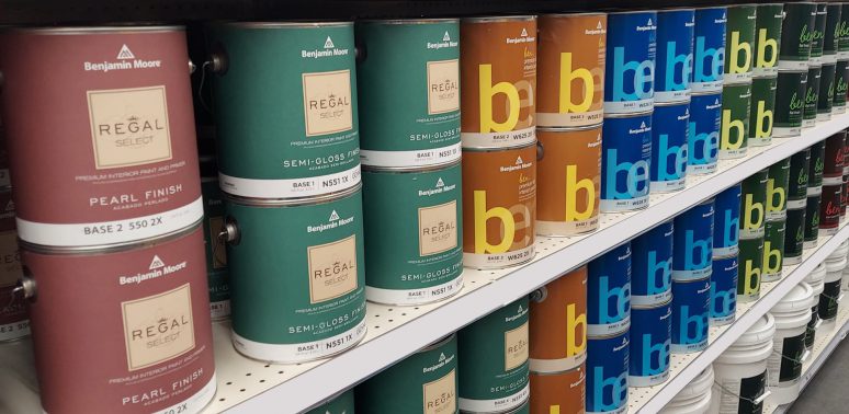
Learn what makes white paint successful in commercial settings—from understanding undertones and lighting to selecting top-performing products from trusted brands like Sherwin-Williams and Benjamin Moore. This guide will help you choose the right white—one that supports your property’s function, enhances its aesthetics, and holds up over time.
- Why white paint is so popular in commercial spaces
- Understanding the different shades of white paint
- How to choose the best white paint for your project?
- 6 Key factors to consider when choosing white paint for commercial spaces
- Best white shades by application in commercial buildings
- White paint color combinations that work well for commercial spaces
- Top recommended white paints from leading manufacturers
- Trending white paints for commercial spaces in 2026
- Trust a commercial painting contractor who understands what your property needs
- Frequently asked questions about white paint for commercial spaces
Why white paint is so popular in commercial spaces
White paint has long been a practical and strategic choice in commercial and rental environments. Its clean, timeless look offers more than just aesthetic appeal—it improves lighting efficiency, makes spaces appear larger, and meets the functional needs of property managers and building owners.
At Painters Inc, we’ve found that across offices, condos, rental units, and industrial buildings, white paint consistently proves to be one of the most adaptable and cost-effective solutions. It’s easy to touch up, widely accepted by tenants, and often required by HOAs or commercial design guidelines—making it a smart standard for high-traffic or turnover-prone properties.
Below are the key reasons white continues to dominate in commercial settings:
Clean and professional appearance
White instantly communicates cleanliness and order—two essential qualities in professional environments like offices, clinics, and retail spaces.
A fresh white interior suggests a space is well-maintained, helping to build trust with employees, tenants, or customers. In rental units or HOAs, this perception also enhances property value and tenant satisfaction.
Versatility for different design styles
From modern minimalism to classic traditional interiors, white serves as a flexible backdrop for a wide range of commercial design aesthetics.
Whether you’re updating a tech company’s headquarters or refreshing an apartment hallway, white works seamlessly with most branding colors, furniture styles, and signage.
Enhances lighting and makes spaces feel larger
High-LRV (light reflectance value) whites bounce natural and artificial light effectively, making even small or windowless rooms feel brighter and more open.
This is especially beneficial in industrial buildings, condo corridors, or office interiors where maximizing light and visual space can improve comfort and productivity.
Frequently required for tenant turnover, HOAs, and compliance
Property managers often default to white paint during tenant turnover due to its neutral, widely accepted appeal. HOAs may require specific white tones for consistency in shared areas or exterior trim.
Additionally, some regulatory standards for commercial or multi-unit buildings prefer light-colored walls for better visibility, safety, and cleanliness.
Neutral backdrop for branding and furnishings
White walls provide a blank canvas for brand visuals, wall art, directional signage, and tenant customization. In commercial offices or leased retail spaces, this neutrality allows tenants to personalize while preserving a cohesive, marketable structure for the property owner.
Easy to touch-up and repaint
From a maintenance perspective, white is one of the easiest colors to source, match, and repaint. Most brands carry standard white formulas year after year, allowing for quick touch-ups between tenants or during routine updates—saving both time and cost.
Understanding the different shades of white paint
Not all whites are created equal. In fact, when selecting the right white paint for a commercial property, subtle differences in undertones and warmth can significantly impact how a space looks and feels. From warm and inviting tones to crisp and modern finishes, each shade of white serves a different purpose.
Based on our experience at Painters Inc, choosing the wrong type of white can result in a space that feels too sterile, too yellow, or visually inconsistent under different lighting conditions.
Let’s break down the five main categories of white paint you’ll encounter in commercial projects:
Warm whites
Warm whites contain yellow, beige, or red undertones, creating a soft and inviting atmosphere. These shades are ideal for spaces where you want to convey comfort, warmth, or a more traditional aesthetic.
In commercial settings, warm whites work well in residential-style offices, waiting areas, and common areas in condominiums or senior living communities. They pair beautifully with wood accents, earth tones, and soft furnishings.
Popular warm white options include Sherwin-Williams Alabaster, Dover White, and Creamy—all known for their subtle warmth without feeling too yellow. Benjamin Moore Ballet White is another favorite, often used in upscale rental interiors and condo lobbies where a welcoming yet refined tone is needed.
Cool whites
Cool whites have blue or gray undertones that give spaces a crisp, clean, and modern feel. These shades tend to reflect more light and are ideal for environments that demand a sense of clarity and sharpness. In offices, medical facilities, or high-tech workspaces, cool whites help reinforce a minimalist, high-efficiency look.
Common choices in this category include Sherwin-Williams Extra White and Olympus White, both of which are frequently used in industrial interiors and bright, modern office settings. Benjamin Moore Super White is another standout, offering high reflectivity and a sharp, gallery-like effect.
Neutral whites
Neutral whites strike a balance between warm and cool tones, making them highly versatile for commercial use. They adapt well to different lighting conditions and furnishings, which is especially useful in spaces with mixed-use functions or varying exposures.
Sherwin-Williams Pure White is one of the most specified neutral whites for offices, corridors, and multi-tenant buildings. Oxford White and White Heron from Benjamin Moore are also excellent options when you’re looking for a balanced, clean appearance that doesn’t lean too far in either direction.
Off-white and soft whites
Off-whites and soft whites have a muted, slightly toned-down quality that offers a calm, understated look. These shades are ideal for creating a sense of warmth without overwhelming the space. They’re particularly useful in rental units, apartment hallways, and older buildings where pure white might appear too stark or cold.
We often see Sherwin-Williams Bone White and Soft White used in apartment complexes and condo interiors. Benjamin Moore Cloud White remains a top choice in soft white palettes—especially in HOAs that want a gentle, classic appearance across multiple units.
Specialty or branded shades
Some white paints fall outside the standard warm/cool/neutral categories and are chosen for their distinct branding or unique visual qualities. These specialty whites can be part of a designer palette or specified by architects for consistency across projects.
Shades like Pearl White, Snow White, and White Swan often appear in upscale retail interiors, boutique offices, or design-forward spaces looking to differentiate themselves. While beautiful, these paints should always be tested under actual site lighting to confirm how they’ll look once applied.
How to choose the best white paint for your project?
Choosing the right white paint may seem simple at first glance, but in commercial spaces, there’s more to it than just picking a “clean” color. Factors like lighting, surface type, finish durability, and building function all influence which white will perform best. From rental turnovers to industrial ceilings, getting the white tone and finish right can reduce maintenance, improve tenant satisfaction, and elevate the space’s professional appearance.

At Painters Inc, we’ve helped clients across office buildings, condos, and industrial facilities navigate the subtle—but critical—differences between shades, sheens, and undertones. The following key factors can guide your selection process and help ensure a successful, lasting result.
6 Key factors to consider when choosing white paint for commercial spaces
Color temperature and undertones
White paint isn’t just “white.” Some whites have cool blue or gray undertones, others have warm hints of yellow, red, or beige, and some remain neutral. The undertone dramatically affects how a space feels: warm whites bring softness and warmth, while cool whites feel sharper and more modern.
In corporate offices or healthcare settings, a cooler white like Sherwin-Williams Extra White can create a crisp, focused environment. For multifamily common areas or traditional lobbies, a warm white such as Alabaster or Ballet White may offer a more welcoming tone.
The impact of paint finishes on appearance and durability
The finish—or sheen—of white paint can dramatically influence how it performs and how it looks once applied. In commercial settings, it’s not just about choosing the right shade of white, but also selecting the right finish to match the function of the space.
Finish affects reflectivity, cleanability, and even how white appears under different lighting conditions. At Painters Inc, we’ve seen projects succeed—or fall short—based on this one detail. That’s why in high-traffic environments, finish selection is just as important as color.
Flat or matte finishes
Flat and matte finishes offer a smooth, non-reflective surface that diffuses light evenly—an important trait when working with white paint, which can easily appear too stark or clinical in the wrong conditions. These finishes are excellent at hiding surface imperfections and are commonly used on ceilings and other low-touch areas.
Flat white paint creates a soft, even appearance that reduces glare from overhead lighting, especially in office ceilings, apartment corridors, or warehouse interiors. However, because flat paint lacks durability, it’s not suitable for areas that require frequent cleaning.
Eggshell finishes
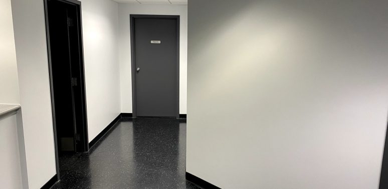
Eggshell finishes offer a subtle sheen—just enough to reflect light softly without becoming glossy. When using white paint, this finish helps maintain a clean, bright look while providing better durability than flat paint. It’s a go-to choice for walls in rental units, office interiors, condo common areas, and other spaces that need to balance aesthetics with practicality.
In commercial environments, white eggshell paint is ideal for moderate-traffic areas where some surface cleaning is expected but where you still want to avoid high shine. It resists minor scuffs and can be wiped down without leaving visible streaks.
At Painters Inc, we often recommend eggshell white for spaces like apartment living rooms, hotel corridors, or multi-use office interiors—areas that must look polished but remain low-maintenance between tenants or visitors.
Satin finishes
Satin finishes strike the ideal balance between subtle elegance and everyday durability. With a soft, velvety sheen, white satin paint reflects more light than eggshell without becoming overly glossy—giving walls a slightly brighter, cleaner appearance. This makes it especially well-suited for commercial properties that need to look refined but also hold up to daily wear.
In our commercial painting projects at Painters Inc, satin white is frequently used in condominiums, HOA hallways, stairwells, and office corridors—places that see steady foot traffic and occasional scuffing. Its wipeable surface allows for easier maintenance compared to eggshell, and the enhanced light reflectivity can help brighten common areas without the harshness of a semi-gloss.
Semi-gloss finishes
Semi-gloss finishes offer a higher level of sheen and exceptional durability, making them ideal for white paint applications in high-contact, moisture-prone, or heavily used areas. The reflective surface enhances brightness and adds a crisp, clean definition to architectural features—especially important when using white, which can otherwise blend into the background.
This finish is commonly used on trim, doors, baseboards, window casings, and restroom walls in commercial buildings. In schools, healthcare facilities, and tenant bathrooms, white semi-gloss paint allows for regular cleaning without degrading the surface.
At Painters Inc, we often apply it in lobbies, utility rooms, and kitchens, where durability and washability are non-negotiable. It also highlights design details—so surface prep must be thorough to avoid highlighting flaws.
High-gloss finishes
High-gloss finishes provide the most light reflectivity and the highest durability of all sheen levels. When applied in white, this finish creates a striking, mirror-like surface that instantly draws attention. It gives spaces a polished, high-end look—but also requires flawless surface preparation, as any imperfection will be magnified under the glossy shine.
In commercial settings, high-gloss white paint is best used for accent elements like feature doors, cabinets, reception counters, elevator surrounds, or custom millwork. It’s also highly effective in environments where sanitation is critical—such as commercial kitchens or restrooms—thanks to its excellent resistance to moisture, staining, and scrubbing.
At Painters Inc, we use high-gloss whites strategically to create visual contrast and enhance durability in high-impact areas.
Light reflectance value (LRV) explained
Light Reflectance Value (LRV) is a measurement of how much light a paint color reflects. On a scale from 0 (pure black) to 100 (pure white), it tells you how bright or dim a paint color will make a space feel. When working with white paint, LRV becomes a critical factor—especially in commercial buildings where lighting conditions vary and energy efficiency, visibility, and atmosphere all matter.
Professionals often use LRV to guide clients toward the right white tone for each environment. A white with too high an LRV can feel harsh under intense lighting, while a white with too low an LRV may dull a space that needs more brightness.
High LRV (brighter spaces)
Whites with high LRV—typically between 85 and 95—reflect large amounts of light, making them ideal for spaces that need to feel bright, open, or more energized. These whites are often used in offices, schools, retail stores, and warehouses where maximizing illumination is essential.
Paints like Sherwin-Williams Extra White and Benjamin Moore Super White fall into this category. They help bounce natural and artificial light around a room, reducing the need for excessive overhead lighting and creating a clean, professional finish.
Low LRV (subdued lighting)
Whites with lower LRV values—typically in the 70s or low 80s—still reflect a good amount of light but offer a softer, more muted effect. These whites are useful in sunlit spaces, older buildings, or residential-style commercial interiors where you want a more relaxed atmosphere.
For example, Bone White and Cloud White have lower LRVs and work well in apartments, condo hallways, or offices with large south-facing windows. They help tone down natural brightness and give the space a more grounded, balanced feel.
How lighting affects white paint appearance
Lighting has a major impact on how white paint looks once applied. Because white reflects more light than any other color, it tends to exaggerate shifts in tone caused by different light sources. In commercial spaces—where lighting conditions vary from room to room—this can lead to unexpected results if not carefully considered during the selection process.
Even the perfect shade of white can look too cold, too yellow, or overly stark depending on how natural and artificial light interact with it throughout the day. That’s why lighting should always be part of the decision-making process when choosing white paint.
Natural vs artificial lighting
White paint can appear dramatically different under natural daylight versus fluorescent or LED lighting. Cooler whites, for example, often look crisp and clean in natural light but may take on a bluish cast under cool-toned artificial fixtures. Conversely, warm white tones may feel balanced in afternoon sunlight but can shift toward yellow under certain indoor bulbs.
In commercial offices, for instance, a white that looks great near windows might appear harsh and sterile under overhead fluorescents. That’s why it’s essential to test paint samples under both natural and artificial conditions before committing.
Directional light: north-facing vs south-facing walls
The direction a space faces also plays a role. North-facing rooms typically receive cooler, indirect light, which can make white walls appear gray or flat—especially if the paint already has cool undertones. In these situations, a warmer white helps counterbalance the chill.
South-facing spaces get abundant warm light throughout the day, which can enhance yellow or beige undertones in white paint. This often works well in residential-style commercial interiors, but in some modern offices or showrooms, a more neutral white may help maintain visual clarity.
East- and west-facing spaces bring their own challenges too, with changing light intensity and warmth throughout the day. Testing samples in each directional exposure is the most reliable way to see how a white will perform in the real world.
Choosing based on property type
Not every commercial space serves the same purpose—and the demands on paint color and finish vary widely depending on the building’s function, usage, and occupants. The right shade of white in a downtown office may feel completely out of place in a multi-family hallway or warehouse interior.
Understanding how different property types influence paint decisions is key to achieving the right look, durability, and long-term performance.
Offices and corporate spaces
In corporate environments, white paint should reinforce a professional, focused atmosphere while supporting the brand’s identity. Neutral or cool whites are commonly used to create clean, modern interiors that feel sharp and efficient.
High-LRV whites can help maximize brightness in windowless offices, while satin or eggshell finishes offer a good balance between refinement and cleanability.
In client-facing areas like lobbies or conference rooms, a crisp white with a subtle sheen enhances light and makes the space feel polished.
Condominiums and HOAs
For condos, townhomes, and HOA-managed properties, white paint plays a big role in maintaining a unified, upscale appearance. Soft or warm whites are often preferred in shared hallways, stairwells, and lobbies to create a welcoming, residential feel.
HOA guidelines may specify certain white tones for consistency in exterior trim, garage doors, or porch ceilings. Here, durability and long-term color retention are just as important as aesthetics—making the right paint formulation and finish essential.
Rental properties and apartments
In rental units, white is a practical default for both turnover efficiency and tenant neutrality. It helps brighten interiors, works with a wide range of furnishings, and allows for quick touch-ups between tenants. A warm or neutral white in an eggshell finish is commonly used on walls, while flat white may be applied to ceilings.
Property managers often choose widely available whites like Dover White or Pure White to ensure consistent results across multiple units and easier maintenance over time.
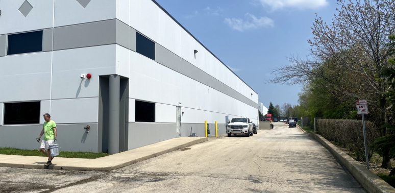
Industrial and warehouse facilities
In industrial settings, white paint is often selected for functionality rather than décor. High-LRV whites improve visibility, enhance lighting efficiency, and help detect spills or safety issues more easily. On ceilings, piping, or structural steel, flat or satin finishes in bright white tones like Extra White can create a clean, uniform appearance.
Durability is key, so paints used in these environments must resist abrasion, dust, and moisture while maintaining their brightness over time.
Professional testing methods before final selection
White may seem like the safest color to choose—but getting it right still takes testing. Subtle shifts in undertone, lighting conditions, and surface texture can completely change how a white paint looks once it’s applied to a large area. That’s why professional testing is a critical step in any commercial painting project.
Rather than relying on small paint chips or digital previews, it’s best to test multiple white paint options directly on the walls or surfaces where they’ll be used. Apply at least two coats in large swatches, ideally in areas with different lighting (natural and artificial) and at different times of day. This helps reveal how undertones shift, how light is reflected, and whether the finish complements nearby materials like flooring, trim, or cabinetry.
For multi-unit buildings or larger commercial spaces, testing in multiple rooms or exposures is essential. What works in a north-facing hallway may not look right in a south-facing lobby.
Experienced painting contractors often recommend testing a mix of warm, cool, and neutral whites in the finish planned for the final application (not just flat). This gives stakeholders a clear, real-world preview of how the final result will look—before committing to gallons of paint across an entire property.
Best white shades by application in commercial buildings
White paint may seem universal, but not all whites perform equally across different surfaces. A shade that looks perfect on a wall might appear too stark on a ceiling or too soft for exterior use. To achieve the best results—and long-term value—it’s essential to match the right white tone and finish to each application.
Below are some of the most effective white paint types for key surfaces in commercial properties:
Best whites for interior walls
For interior walls in commercial spaces, warm or soft whites help create a welcoming and comfortable environment. These tones soften harsh lighting and make office interiors, rental units, or condo hallways feel more inviting without sacrificing cleanliness or professionalism.
Use whites with subtle beige or creamy undertones, especially in spaces where tenants or clients spend long periods of time.
Recommended finish: Eggshell or satin – offers cleanability while reducing glare.
Best whites for ceilings
Ceilings benefit from cooler-toned whites with flat finishes. These whites reflect light evenly without drawing attention upward, creating a more grounded visual flow in office settings, commercial corridors, or apartment units.
Flat finishes also hide imperfections common in older ceilings or large ceiling expanses.
Recommended finish: Flat or matte – minimal reflection, hides surface flaws.
Best whites for trim, doors, and accents
Trim, doors, and other architectural accents require more durable, higher-gloss finishes that can withstand frequent contact and cleaning. White paint in these areas should contrast slightly with the walls for crisp definition.
Choose whites that are clean and neutral or cool-leaning for a sharper, professional finish.
Recommended finish: Semi-gloss or high-gloss – enhances durability and visual clarity.
Best whites for exterior walls and facades
Exterior whites should be selected for both aesthetics and long-term performance. Look for tones that hold up under UV exposure without yellowing or fading. Soft off-whites and slightly warm shades often look best in outdoor light and pair well with stone, brick, or landscaping.
Paints should be formulated for durability, weather resistance, and color retention.
Recommended finish: Satin or low-luster exterior finishes – balance visual appeal with weather resistance.
White paint color combinations that work well for commercial spaces
While white paint stands strong on its own, it’s often even more effective when paired with complementary colors that define spaces, create contrast, or align with branding. The right color combinations can turn plain white walls into polished, professional environments that feel intentional—whether in an office lobby, apartment hallway, or exterior façade.
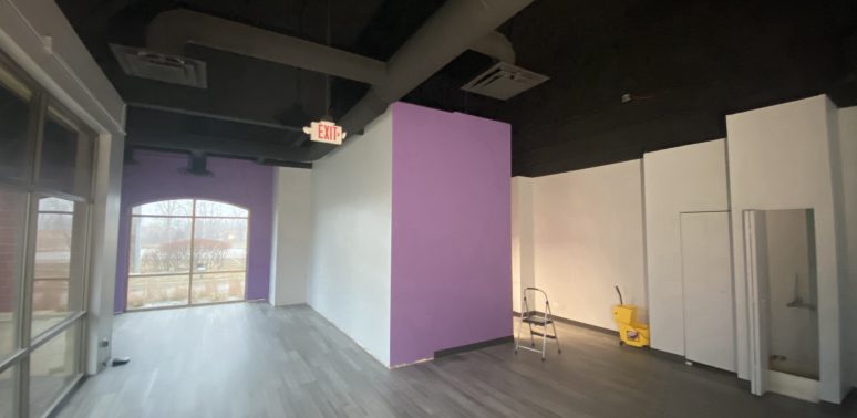
Here are some proven white-based color pairings that work especially well in commercial settings:
White + charcoal gray
A classic high-contrast combination that’s modern, clean, and sophisticated. White walls with charcoal trim, doors, or signage provide depth and visual hierarchy. This pairing is especially popular in office buildings, medical spaces, and high-end condo exteriors.
White + navy blue
A bold, professional look that blends traditional and modern aesthetics. Navy adds weight and confidence, making it ideal for accent walls, branding elements, or exterior doors. It works particularly well with crisp or neutral whites.
White + soft beige or taupe
A subtle, low-contrast palette used in residential-style rentals or senior living properties. This combination helps create a calming, approachable environment. Ideal for common areas, corridors, or leasing offices.
White + black accents
Used sparingly, black fixtures, signage, or trim against white walls delivers a sleek, minimalist look. This pairing is especially effective in industrial-style spaces or modern retail environments.
White + natural materials (wood, stone, metal)
White pairs beautifully with natural textures. Wood accents warm up cooler whites, while stone and metal surfaces offer contrast without adding color. These combinations are common in lobby designs, exterior facades, and upscale multi-family units.
Color combinations don’t just enhance aesthetics—they help define the identity and usability of a commercial space. When thoughtfully executed, white-centered palettes can elevate both functionality and style.
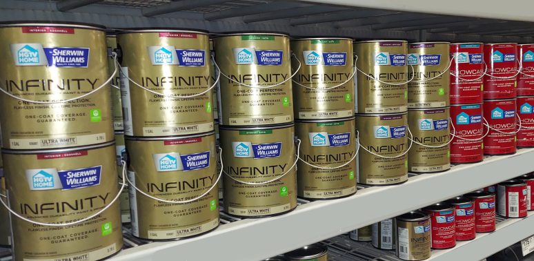
Top recommended white paints from leading manufacturers
With so many shades of white available, choosing the right one for a commercial project can feel overwhelming. Undertones, lighting conditions, and finish all play a role in how a color performs—but starting with well-tested options from trusted manufacturers can make the decision easier.

The following white paints are widely used across commercial, rental, HOA, and industrial properties, selected for their proven performance, broad appeal, and versatility in real-world settings.
Warm white paints
Warm whites from Sherwin-Williams and Benjamin Moore feature soft beige, yellow, or creamy undertones—making them ideal for commercial spaces that need a more welcoming, residential feel.
These shades are commonly used in office interiors, multifamily housing, condo common areas, and other spaces where warmth and comfort are important.
- Sherwin-Williams Alabaster (SW 7008) – Balanced and timeless; warm without being too creamy
- Sherwin-Williams Dover White (SW 6385) – A rich, creamy white that feels traditional and cozy
- Sherwin-Williams Creamy (SW 7012) – Soft and gentle, ideal for warm-toned interiors
- Benjamin Moore Linen White (OC-146) – Elegant with a slightly aged character, often used in upscale rental spaces
- Benjamin Moore Ballet White (OC-9) – A neutral-warm blend that adapts well under changing lighting
- Benjamin Moore Cloud White (OC-130) – A warm classic that performs well in both interiors and exteriors
Cool white paints
Cool whites from Sherwin-Williams and Benjamin Moore feature blue or gray undertones that create a clean, crisp look—ideal for modern commercial spaces that prioritize brightness and visual clarity. These shades are often used in offices, medical buildings, retail spaces, and other environments where a sharp, professional appearance is essential.
- Sherwin-Williams Extra White (SW 7006) – Pure, bright white with a high LRV; excellent for clean interiors and ceilings
- Sherwin-Williams Olympus White( SW 6253) – Subtle gray-blue undertone that adds visual interest without overpowering
- Sherwin-Williams Snowbound (SW 7004) – A soft cool white with muted warmth, great for contemporary interiors
- Benjamin Moore Super White (OC-152) – Bright and reflective, often used in galleries or high-end office environments
- Benjamin Moore Chantilly Lace (OC-65) – Ultra-clean and luminous, popular in minimalist and modern design schemes
Neutral white paints
Neutral whites from Sherwin-Williams and Benjamin Moore sit comfortably between warm and cool tones, offering maximum versatility across different lighting conditions and design styles. These shades are ideal for commercial interiors where consistent color is needed throughout various spaces, such as offices, multi-unit buildings, or mixed-use facilities.
- Sherwin-Williams Pure White (SW 7005) – Clean and bright with minimal undertone; a highly adaptable choice
- Sherwin-Williams Eider White (SW 7014) – A soft, muted neutral with subtle gray undertones
- Sherwin-Williams Oxford White (HGSW4026) – A balanced, clean white with just enough warmth to avoid feeling stark
- Benjamin Moore White Heron (OC-57) – Soft and neutral, perfect for broad wall applications in professional settings
- Benjamin Moore Simply White (OC-117) – Slightly warm yet still reads neutral in most lighting conditions; a designer favorite for its flexibility
Off-whites and creams
Off-whites and cream tones provide a softer, more subdued alternative to bright white. With gentle warmth or muted undertones, these shades are ideal for rental properties, multi-family buildings, or any commercial space that benefits from a more relaxed, less clinical look. They’re especially useful in corridors, common areas, or older properties where a pure white may feel too stark.
- Sherwin-Williams Navajo White (SW 6126) – A mellow, creamy off-white with a touch of beige; great for traditional interiors
- Sherwin-Williams Creamy White (SW 7012) – A soft, buttery white that adds warmth without overwhelming
- Benjamin Moore Bone White (OC-145) – A muted off-white with beige undertones, excellent for timeless or traditional looks
- Benjamin Moore Soft White (2170-70) – Understated and easy to pair with neutral furnishings or warm lighting
Trending white paints for commercial spaces in 2026
Each year, certain shades of white gain popularity due to shifts in commercial design trends, lighting technology, and tenant preferences. In 2026, we’re seeing a move toward balanced, clean whites that work across both modern and transitional spaces.
Property managers and designers continue to favor shades that offer high versatility—colors that look professional in daylight but hold up under artificial lighting, especially in open floor plans, shared spaces, and minimalist interiors.
Below are some of the most popular white paints from Sherwin-Williams and Benjamin Moore, widely used in commercial, rental, and HOA-managed properties this year:
Sherwin-Williams most popular whites
In 2026, Sherwin-Williams white paints continue to set the standard in commercial projects due to their balanced undertones, dependable performance, and broad design appeal.
The most popular shades in their palette reflect current trends toward soft, versatile whites that maintain clarity under both natural and artificial lighting. These colors are favored for their ability to create a clean, modern look without feeling sterile—making them ideal for offices, common areas, rental interiors, and exterior façades.
Their popularity is driven by how effortlessly they work across a range of finishes, architectural styles, and space types, from minimalistic interiors to traditional buildings.
Trending Sherwin-Williams whites in 2026 include:
- Pure white
- Alabaster
- Snowbound
- Dover white
Benjamin Moore most popular whites
In 2026, Benjamin Moore’s most popular white paints reflect a growing demand for softness, subtle warmth, and timeless elegance in commercial spaces. These shades are known for their refined undertones and adaptability—qualities that make them especially effective in multi-unit residential buildings, office interiors, and hospitality environments. The trend leans toward whites that feel inviting without sacrificing brightness, and that can shift gently with natural light throughout the day.
Designers and property managers often choose Benjamin Moore whites for their nuanced character and consistent appearance across various finishes and lighting conditions. They perform well in both modern and traditional settings, whether paired with natural materials or crisp architectural lines.
Trending Benjamin Moore whites in 2026 include:
- Pure white
- Alabaster
- Snowbound
- Dover white
Trust a commercial painting contractor who understands what your property needs
When it comes to painting business properties, the right products are only as effective as the team applying them. With years of hands-on experience and a long list of successfully completed projects, we understand the unique requirements of commercial, industrial, rental, and HOA-managed properties.

From selecting the most suitable white paint to delivering precise, durable finishes, we approach every project with a focus on longevity, consistency, and minimal disruption. Our team is well-versed in the demands of high-use environments, varied lighting conditions, and the performance expectations of property managers and facility owners.
Whether you’re updating interiors, refreshing exteriors, or starting a full-scale repaint, you can rely on a commercial painting contractor that brings technical knowledge, professional execution, and proven results.
Contact us today to discuss your next project and get expert guidance tailored to your property.
Frequently asked questions about white paint for commercial spaces
Still unsure which white paint is best for your commercial project? This FAQ section addresses the most common follow-up questions from property managers, designers, and business owners—covering application tips, lighting effects, product differences, and finish recommendations to help you make confident decisions.
What’s the difference between warm white and cool white paint?
Warm whites have beige or yellow undertones, creating a cozy feel, while cool whites include gray or blue undertones for a more modern, crisp appearance.
Which white paint is best for commercial ceilings?
High-LRV, clean whites like Sherwin-Williams Extra White (SW 7006) or Pure White (SW 7005) work best to maximize light reflection and maintain a clean look.
Can the same white paint be used on walls, ceilings, and trim?
Technically yes, but for best results, adjust the finish (e.g., matte for ceilings, eggshell or satin for walls, semi-gloss for trim) and consider undertone consistency.
What’s a good white paint for older buildings or common areas?
Softer, off-white tones like Sherwin-Williams Creamy (SW 7012) or Benjamin Moore Bone White (OC-145) help avoid a stark or clinical appearance.
Is there a universal white that works in most commercial settings?
Neutral options like Benjamin Moore Chantilly Lace (OC-65) or Sherwin-Williams Alabaster (SW 7008) are highly versatile and widely recommended.
Do lighting conditions affect how white paint looks?
Yes. North-facing rooms tend to make whites appear cooler, while warm lighting can make some whites look yellowish. Always test samples on-site.
What’s the best white paint for high-traffic commercial areas?
Durable paints with slight warmth like Sherwin-Williams Alabaster (SW 7008) or Benjamin Moore Cloud White (OC-130) help conceal wear while maintaining a clean appearance.
Which white paint works best under fluorescent or LED lighting?
Under artificial lighting, neutral whites like Sherwin-Williams Eider White (SW 7014) or Benjamin Moore White Heron (OC-57) maintain balanced tones without appearing too yellow or blue.
Is there a difference between residential and commercial-grade white paint?
Yes. Commercial-grade paints are formulated for greater durability, washability, and coverage on larger-scale surfaces like office walls, hallways, or multifamily units.
How do I choose the right white paint finish for my commercial project?
Use flat or matte for ceilings, eggshell or satin for walls, and semi-gloss for trim or doors to balance durability with aesthetic appeal.